Sava Bicycles Brand | Strengthening the brand authority for cyclists
About the client
The SAVA bicycle brand was founded in 2005 in Sindelfingen, Germany as the SAVA Bicycle Creative Design Team. However, production and sales were first concentrated in Southeast Asia. As one of the few bicycle brands, it started to manufacture its own frames using the best material for bicycles – carbon. With direct sales channels primarily focused on the customer, it soon achieved great success and revolutionized the sports bike market. The combination of superior materials, 100% control in production, progressive design and attractive pricing is a proven path to success in all sectors.
Services
Web design, user interface design, UX optimization, visual language
Company
Cimpress
*All projects with Cimpress were under NDA (non-disclosure agreement), so the brand identity and data were changed for the case study.
Project and client need
The client needed a website that would capture the brand’s unique approach to manufacturing and quality. Starting from scratch, we developed the user flows and visual design to create a website that effectively communicates Sava’s brand identity. The new website showcases the brand’s latest fleet, offers an easy-to-navigate shopping experience, and strengthens the connection with its cycling enthusiasts audience. Through meticulous design and a deep understanding of the brand’s ethos, we created a digital platform that not only enhances Sava’s online presence but also aligns perfectly with its image as a leader in the cycling industry.
The measured results will be found below 👇
Challenge
The challenge consisted of revamping both the user interface and the user experience in a simultaneous way by bringing the DNA of the brand into the digital realm without losing the brand’s visual identity in the bike manufacturing world.
Approach
My approach consisted of studying and observing the visual language that the brand uses to manufacture its products and translating it into a web form by creating design elements and components that visually speak the bike world language and compete well with other cycling brands.
Problems & issues
The current landing page is outdated
The current landing page of the website looked bland, with too much negative space and out of the brand reputation in the bike manufacturing world so I figured that I should start with the landing page from which the first impression starts.
Brand identity “emotional response” is missing
Sava built and sold bikes to over 50,000 satisfied customers in Europe and thousands around the world without having a top-notch web game which will serve it well in the online channel and completes the brand identity on all ends.
Lack of visual consistency
Consistency makes it easier for users to navigate and use the website because they don’t have to learn new ropes to get around. This is lacking when looking at the current layout and that knocks the possibility of creating an emotional response.
The impact on the company
The old technology and outdated view on the website didn’t provide the best possible user experience and impacted the brand’s image.
Goal & vision
Consistent visual language
Creating a sense of continuity and cohesion was the first and most important step because it is the foundation that will encompass all the rest of the steps.
Familiarity across web experiences
Creating defined patterns and elements will help us design a variety of experiences that will always feel like Sava.
Top-notch visual content
Creating visual treatments like hero sections and banners leveraging distinct photography and typography to bring the interface to life.
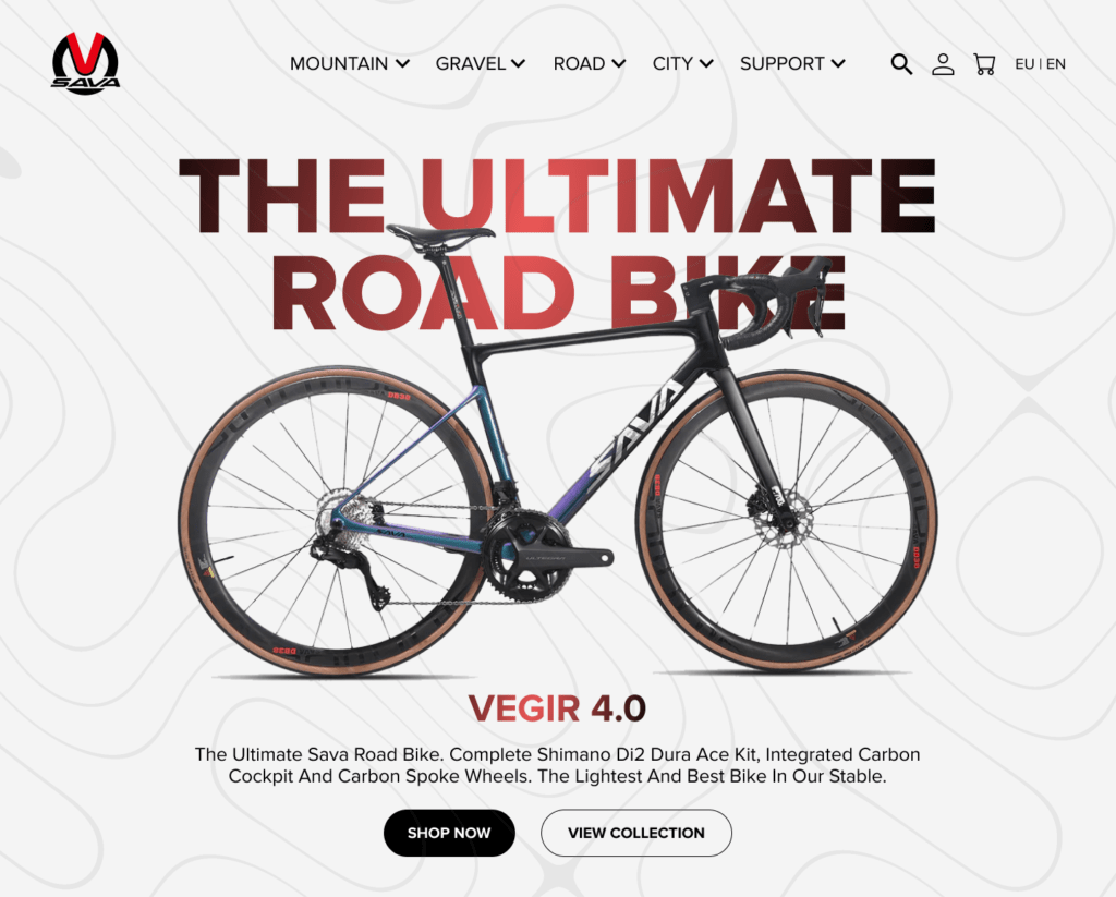
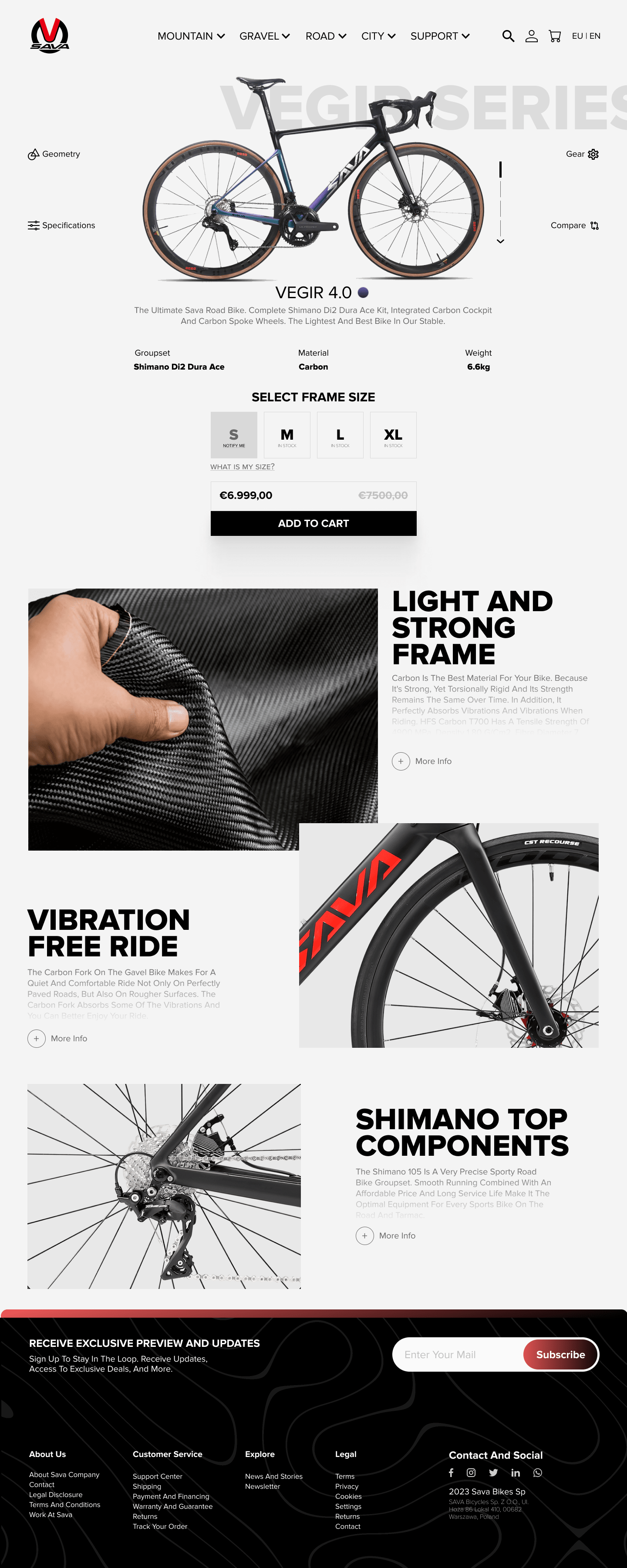
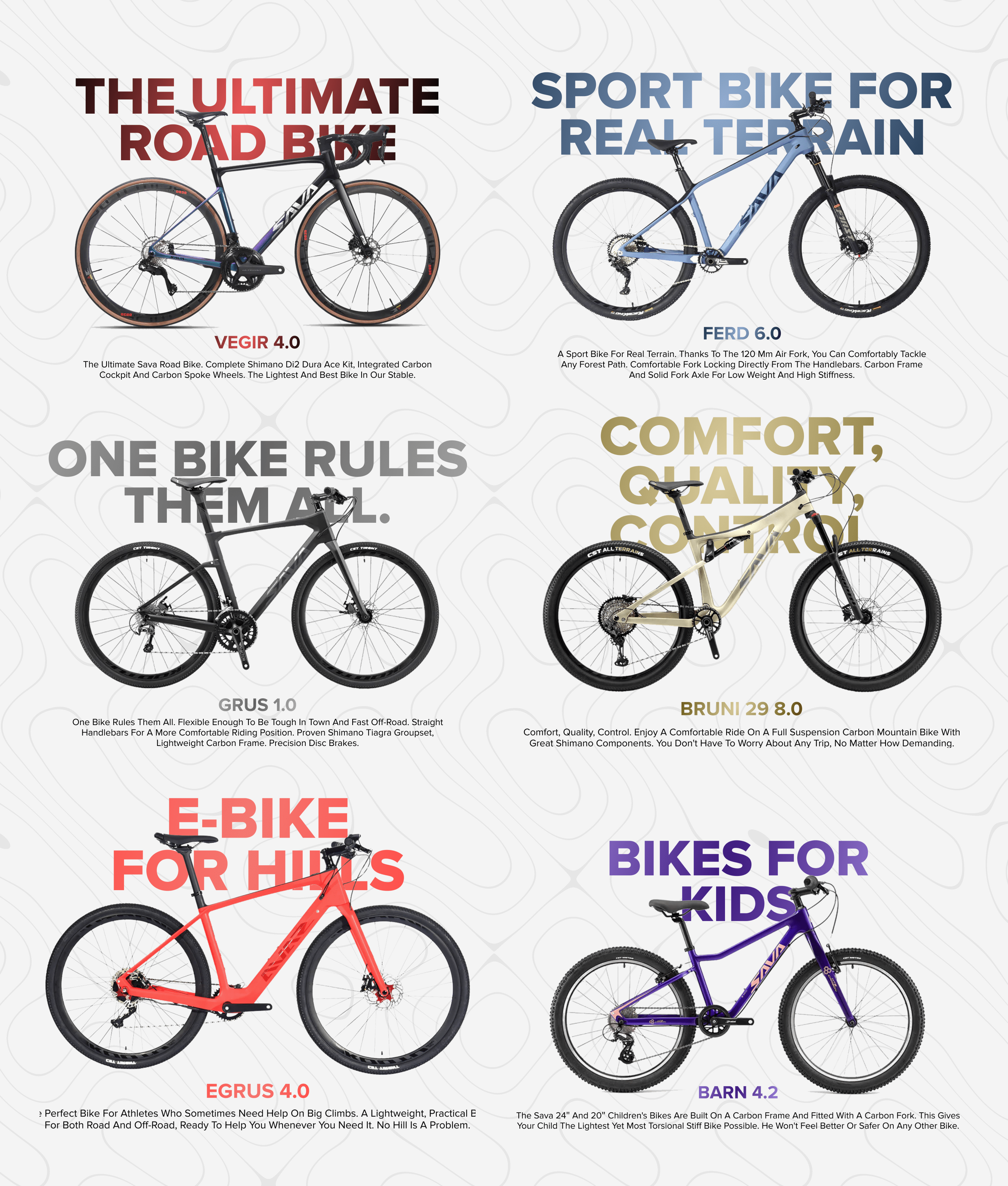
Hero Page Redesign
Highlighting a product & invoking a feeling
Structuring the layout by highlighting one of the brand’s flagship products as a focal point along with two CTA buttons, leveraging the brand color style for the typography also creating a background texture that emulated the twisty roads of a cyclist’s journey.
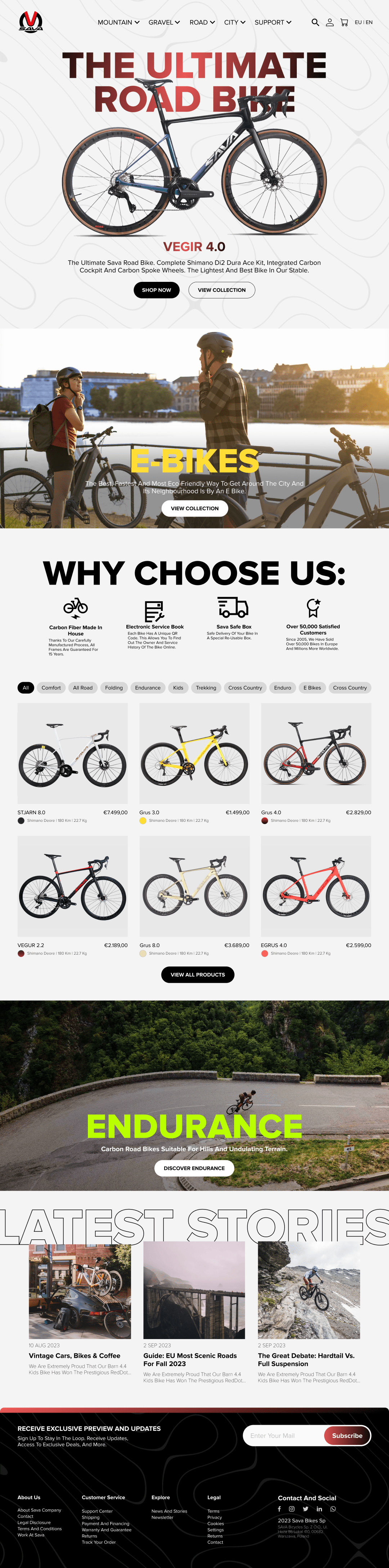
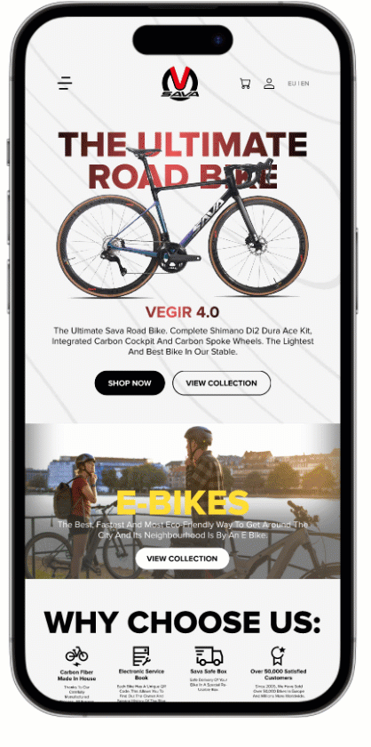
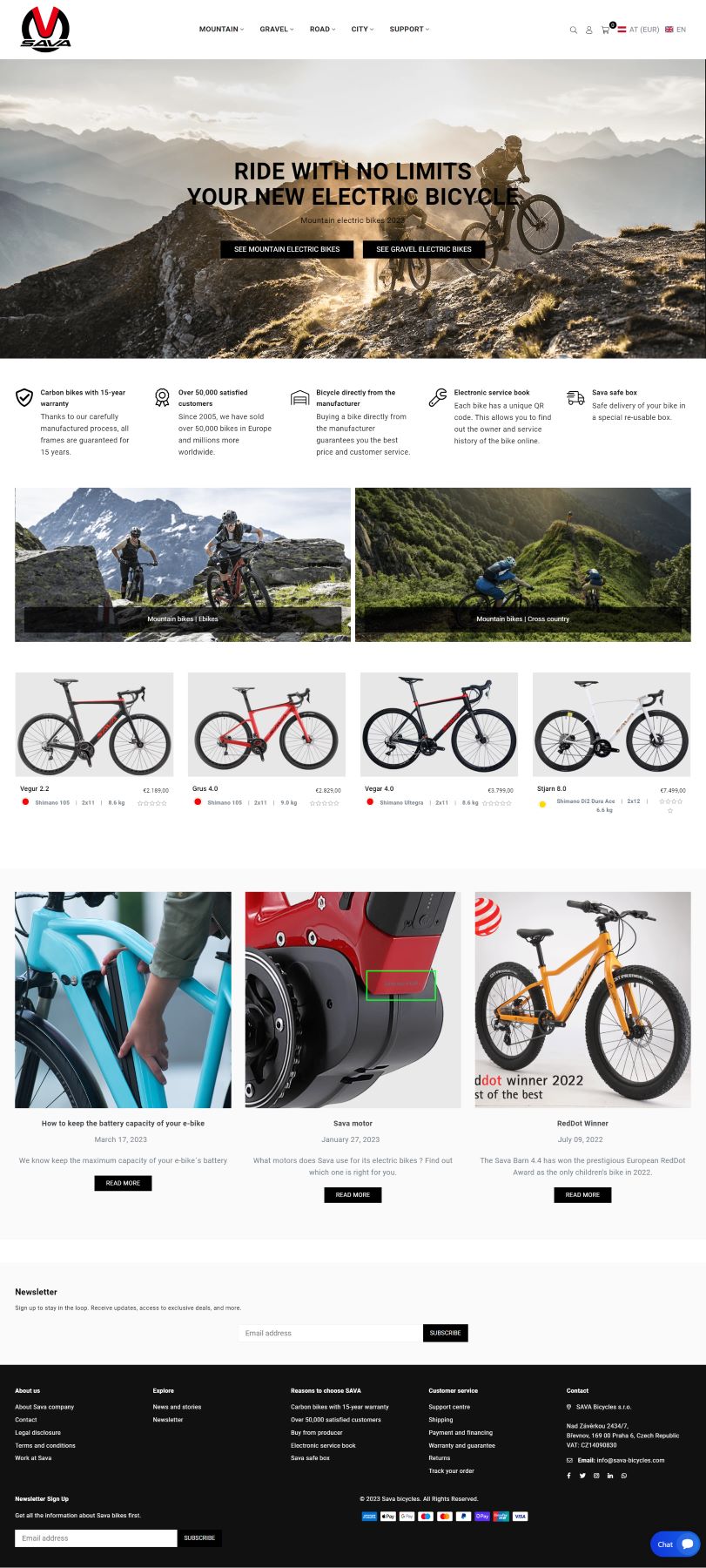
Home page UI Redesign
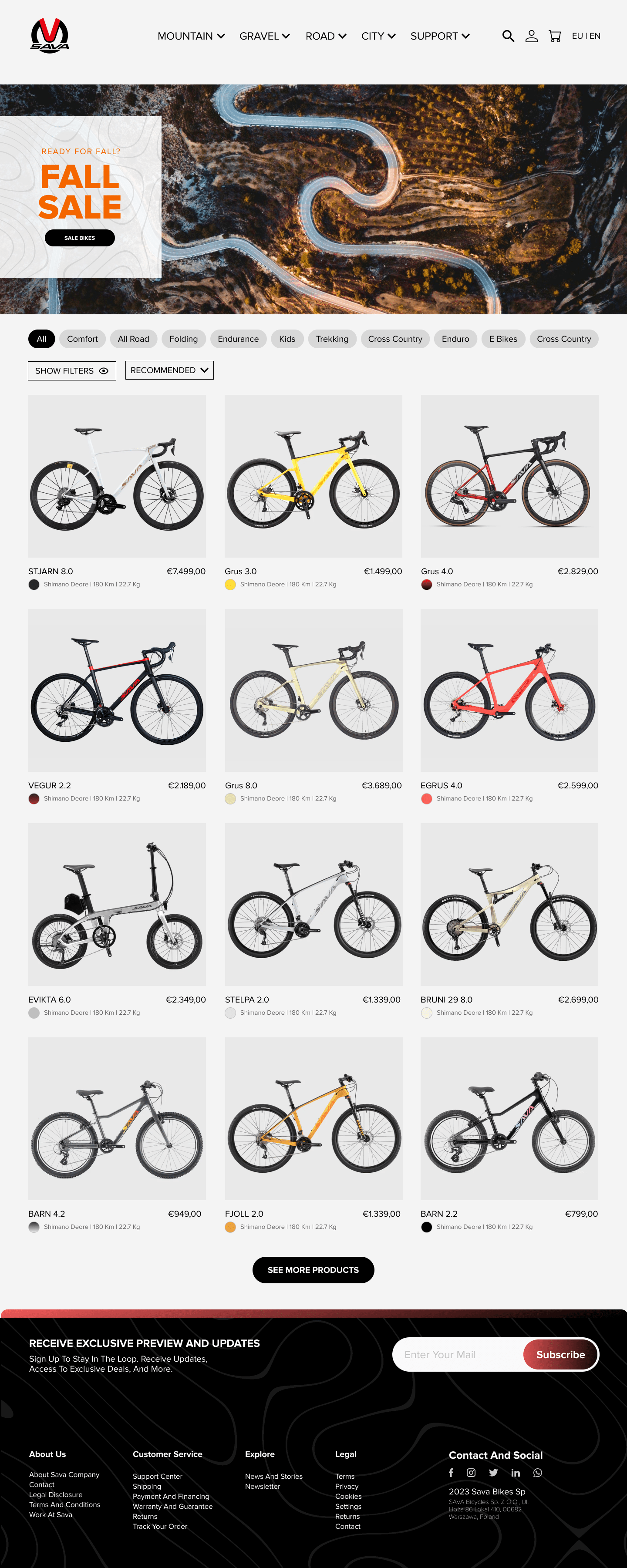
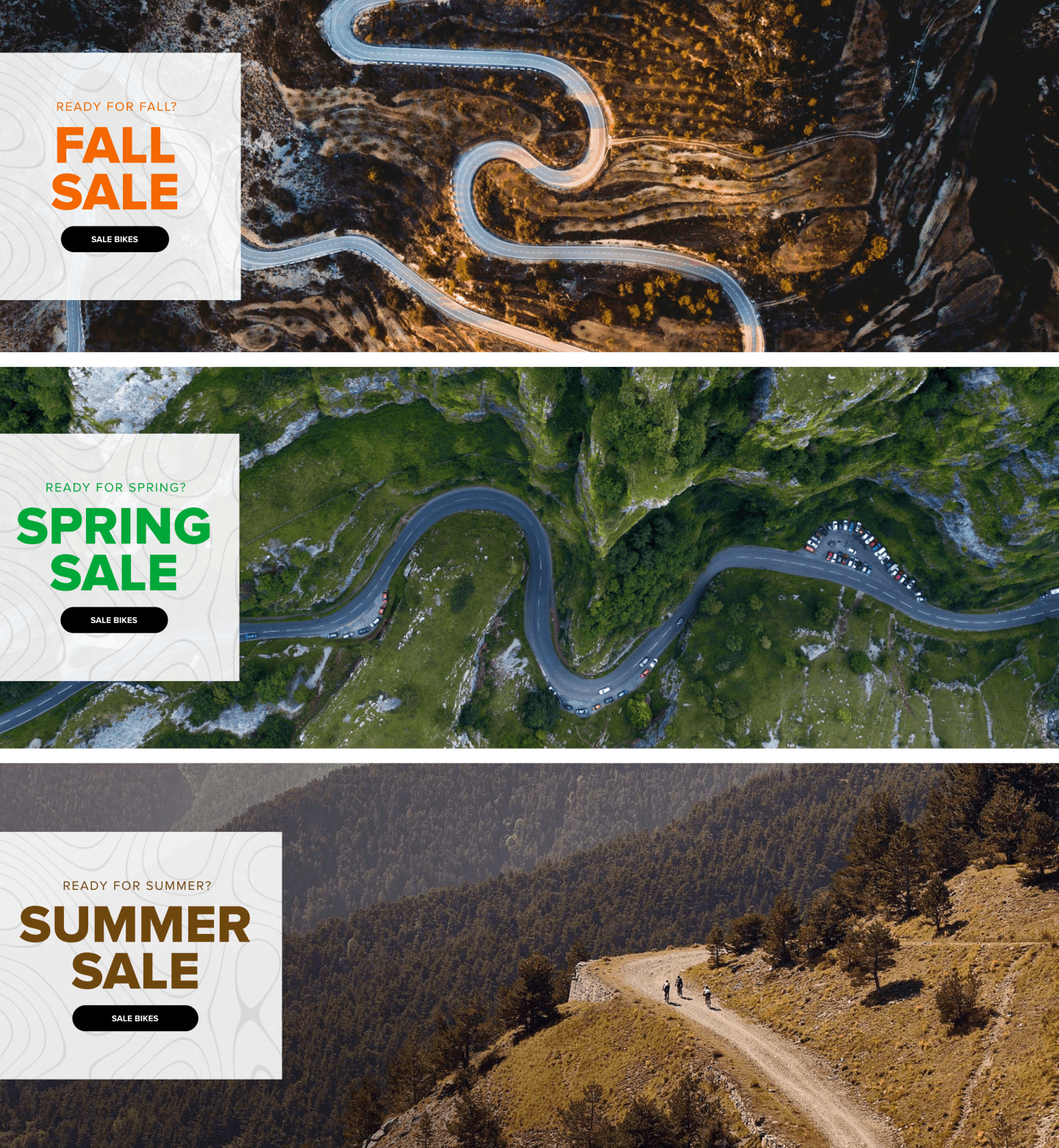
Product collection UI redesign
A new look & feel
Approachable, well-crafted graphical elements, cyclist-inspired banners and curated stories with an aim to invite cycling enthusiasts to dive in.
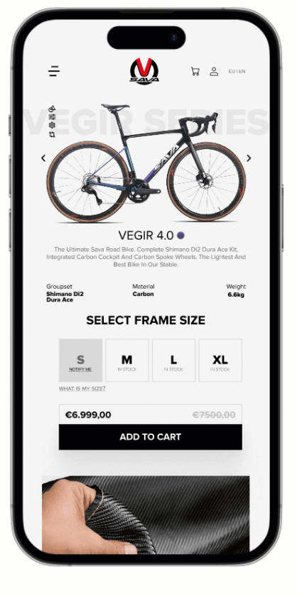
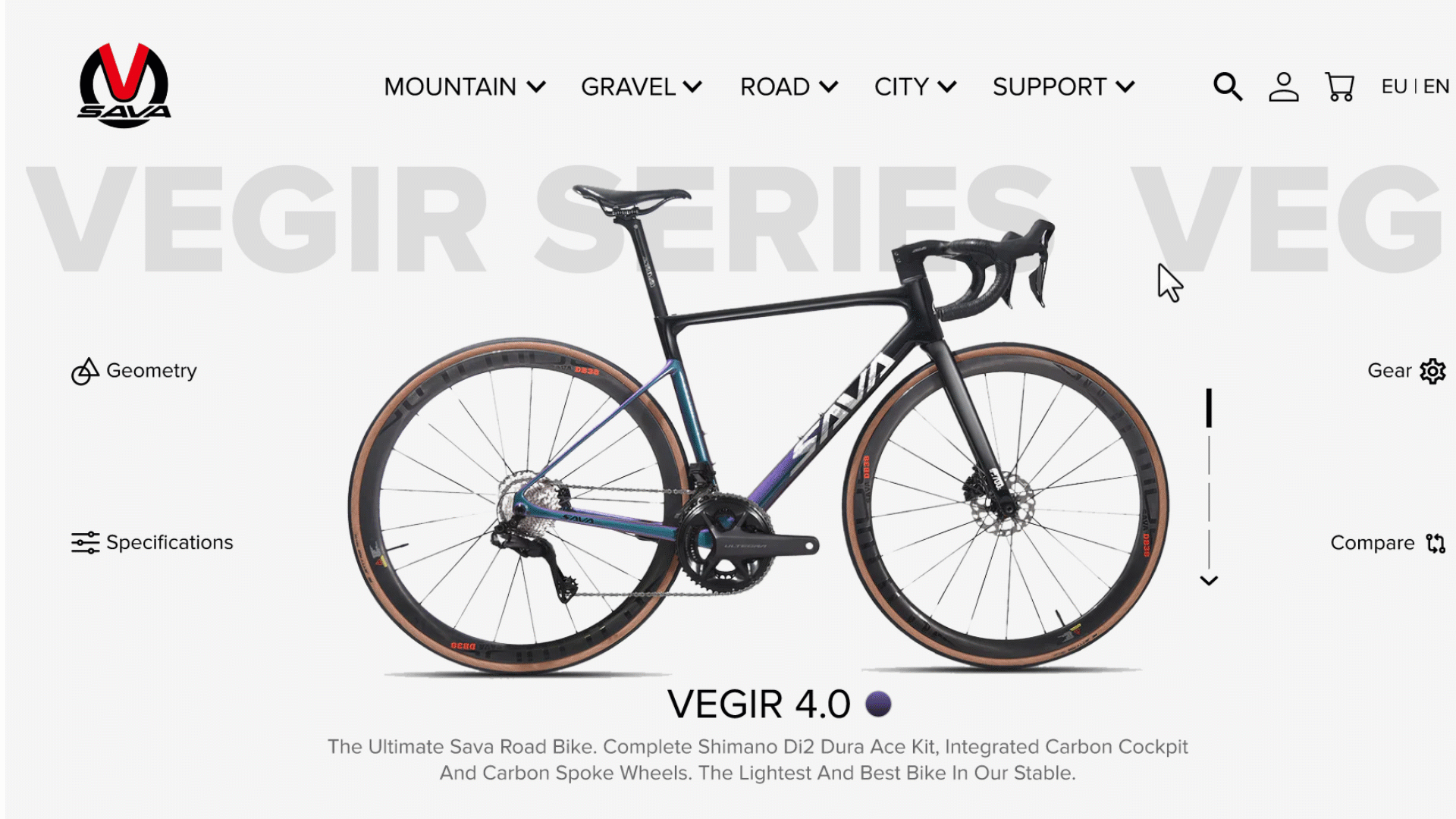
Product page UI Redesign
Mobile version
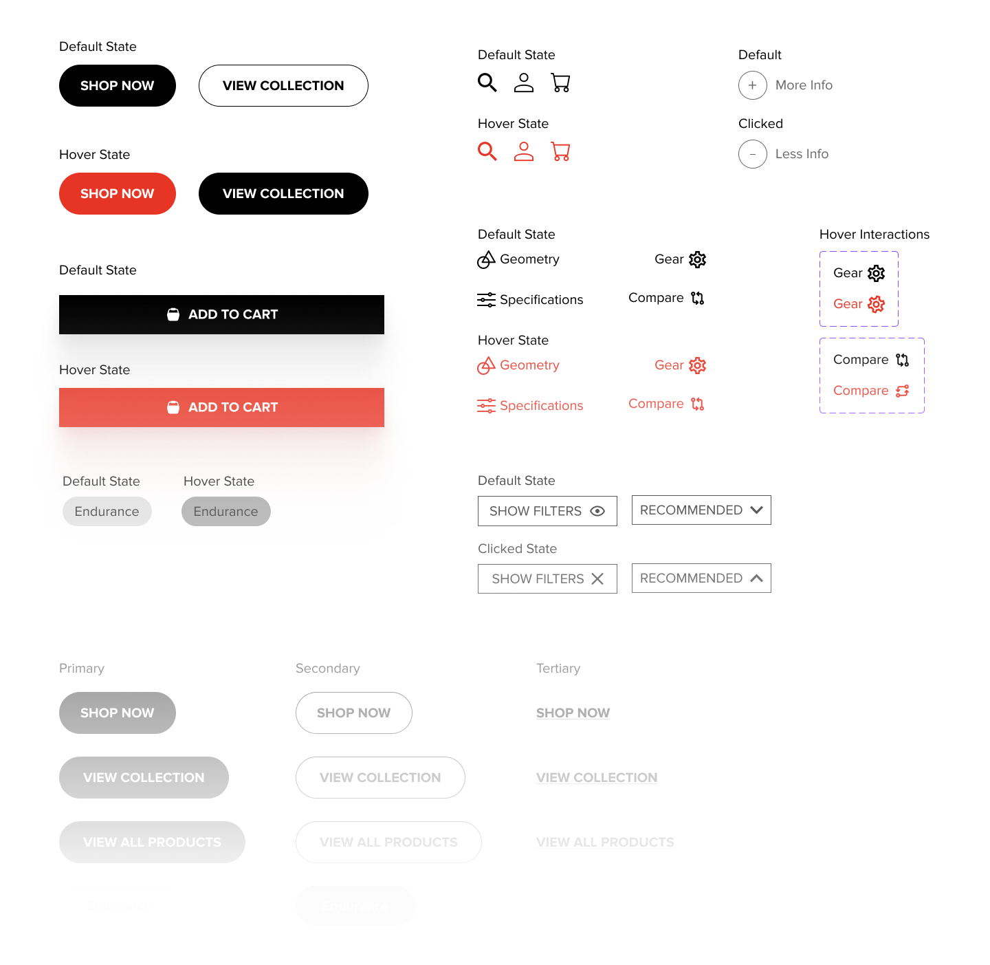
Graphical elements
Components and interactions
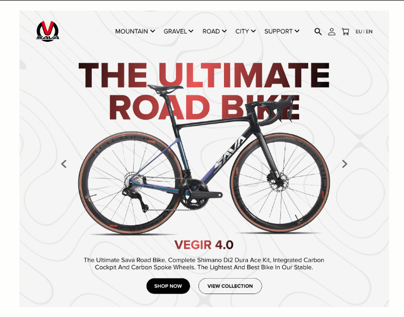
Before & After
Measurable result & impact
The usability test was done in collaboration with the marketing team at Sava with several users from different backgrounds over 2 months after the site relaunch, here are some of the key metrics that we measured based on real-time data