Biat | UX optimization and product differentiation
About the client
Created in 1976, BIAT – Banque Internationale Arabe de Tunisieis today the country’s leading bank and ranks first on many indicators.
BIAT – a universal bank , has developed all banking activities and constitutes a banking group with its subsidiaries in the fields of insurance, asset management, private equity or stock market intermediation.
Supporting its development on proximity and societal commitment, BIAT puts its expertise and solidity to the benefit of its customers and the Tunisian economy.
Services
Product design, user interface design, UX optimization, prototyping, user research
Company
Cimpress
*All projects with Cimpress were under NDA (non-disclosure agreement), so the brand identity and data were changed for the case study.
Project and client vision
Based on a customer satisfaction survey, the client and the stakeholders based in the UK envisioned a fresh, modern, and visually appealing new app with new differentiating features.
Over the course of eight months, I led the project from inception to completion. This involved crafting the overall strategy, redesigning the entire mobile application interface, and collaborating with the product manager to ensure the newly added features correspond with the stakeholders vision . The result is a highly interactive platform that made a significant impact based on the NPS score but also aligns with the client’s vision of an innovative and usable app. Through strategic planning and collaboration, BIAT stands out as a powerful banking app for enhancing user retention online and in the real world.
The measured results will be found below 👇
Approach
My approach consisted of analyzing the customer satisfaction survey to pinpoint the issues to come up with a better UX strategy and tackle the visual design issues by making use of the corporate identity to design the new product app along with introducing a new set of features through streamlining a consistent visual language, navigation and UI patterns.
Discovering and defining the problems
No visual hierarchy
The disarrangement of elements on the UI impacted the UX, basically creating a hardship for the user to identify where to look, and how to find services and eventually disrupting the whole navigation.
No defined journey
The focus on the backend development of the app led to neglect of creating a clear strategy which impacted the user experience exponentially.
Company and product perception
Without an on-brand user experience, a product is just an ‘app’ so translating the bank’s success in the real world to the web/digital realm is now more crucial than ever to maintain that public perception across all levels.
Lack of needed features
The company introduced the app with minimal to no features that were originally translated from the real world B2C processes without any consideration of innovative technologies implemented like in today’s fintech products.
Goal & vision
Strengthening the value proposition of the product
Through research and studying the customers, creating a unique value proposition is crucial to maintaining the relevance of the services to all users of different ages as well as creating that desired product differentiation.
Introduce new features
Introducing new features and patterns could create the potential for product differentiation which will make the company stand out in the market especially when the features are needed based on the user’s feedback.
Create visual consistency
Taking care of the UI realm by using the home screen as the main container of all features and navigations to increase visual clarity, reduce cognitive load and create an on-brand emotional response.
Solution overview
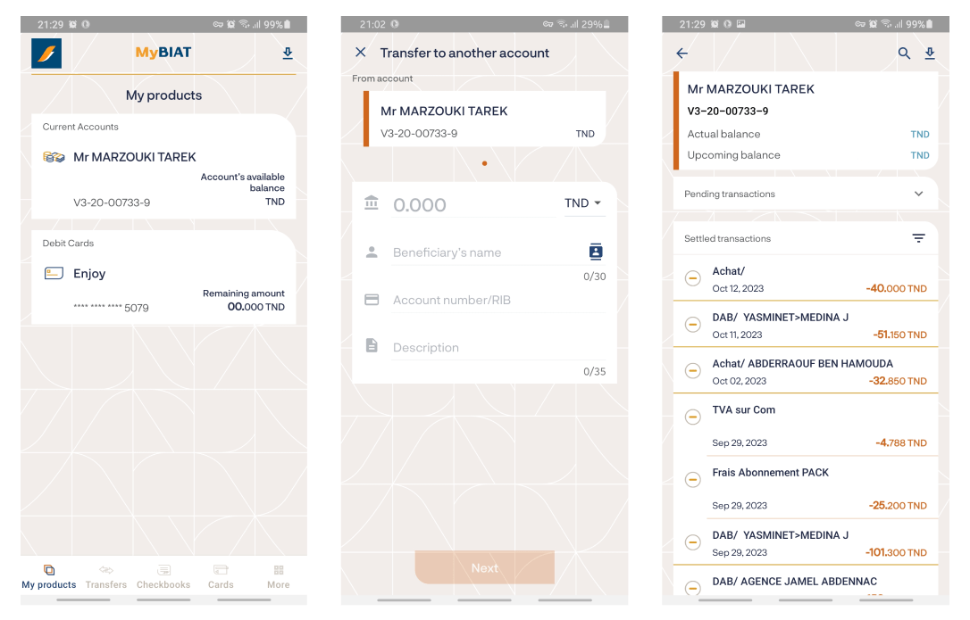
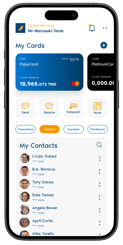
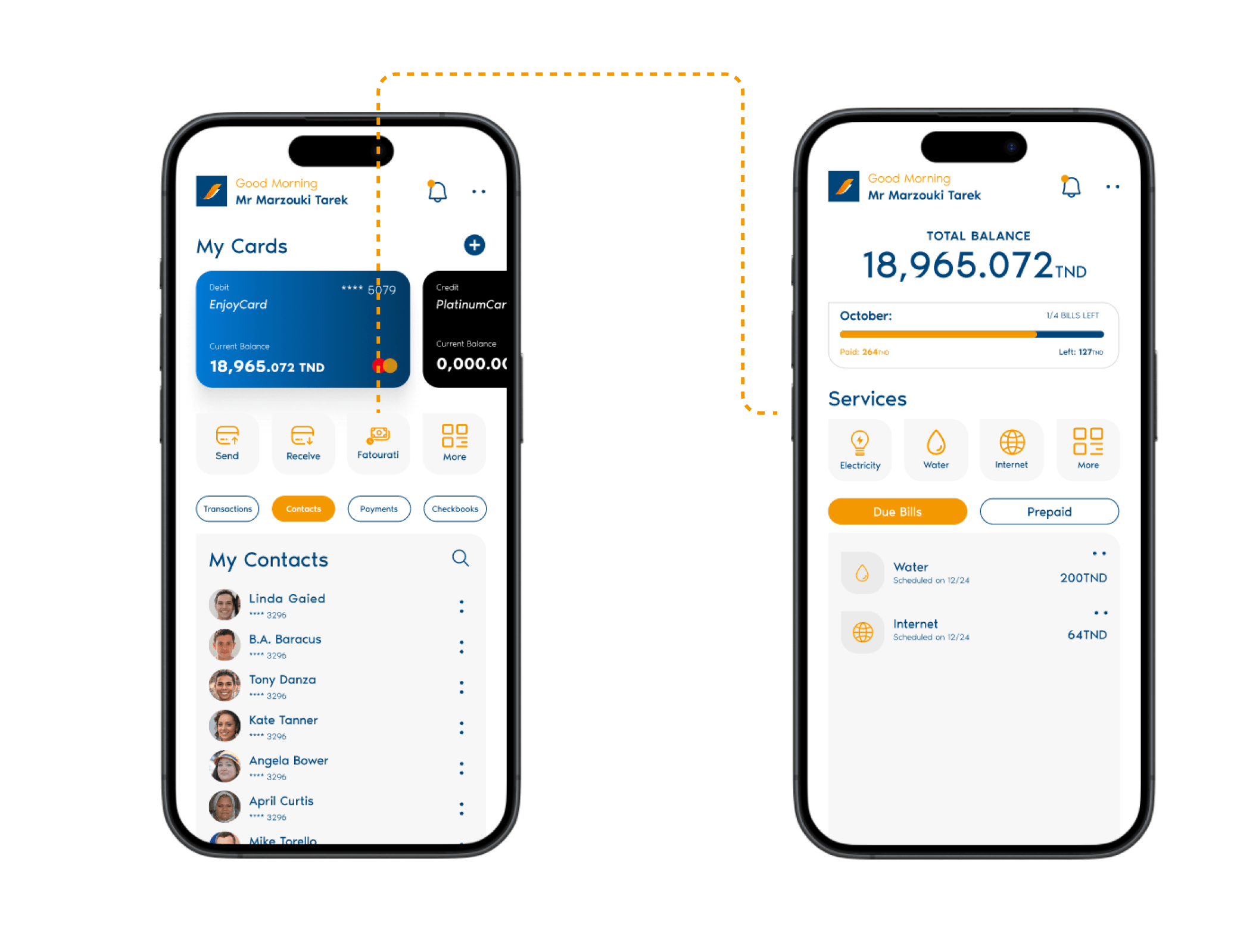
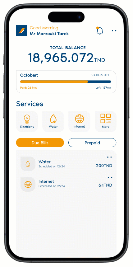
Home Screen
A fresh UI with newly designed components that speaks to the brand both on the market and on the web.
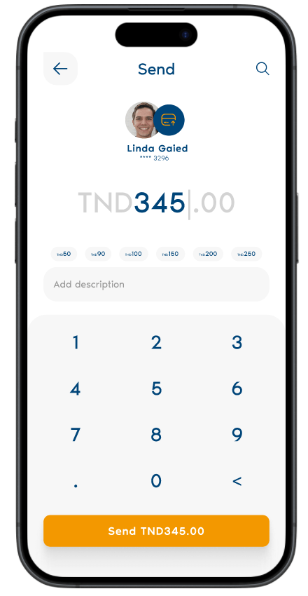
Send Money
Sending money now is as easy as sending a text message, it wouldn’t require much thought.
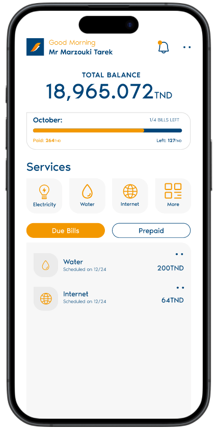
Bill Payments Analytics
The newly introduced feature gives the user the ability to check his bill analytics, what is due and what is paid in the most intuitive manner.
Auto Renew Feature
The 2nd newly introduced feature gives the user the luxury of auto-renewing his bill payment whether it’s a one-time schedule or a frequent schedule along with many options.
User Research & Analysis
Interviews
Three interviews were conducted with the targeted audience from different stages of life about their time using a banking app, here are the key issues that were concluded:
Lack of clarity
Technical issues
Lack of services
Time-consuming
User personas
The Proactive Mother/Father
Wants an easy and straightforward way to manage cards, pay the bills and manage them in one place and her frustration is forgetting to renew her internet subscription on time.
The Busy Single Man/Woman
Wants an easy way to get organized and get notified of new bills, his frustration is standing in a queue every time he needs to pay a bill.
The Elderly Folks ‘Men and Women’
Wants a simple way to check his balance, and have a contact list to minimize typing every time he wants to send money or pay a bill, his frustration is that the interface won’t be user friendly and intuitive.
Goals and design principles
Three interviews were conducted with the targeted audience from different stages of life, here are the key points that were concluded:
Keep it intuitive
Clarify complexity
Deliver values, not features
Consistency, at scale
Empower clients
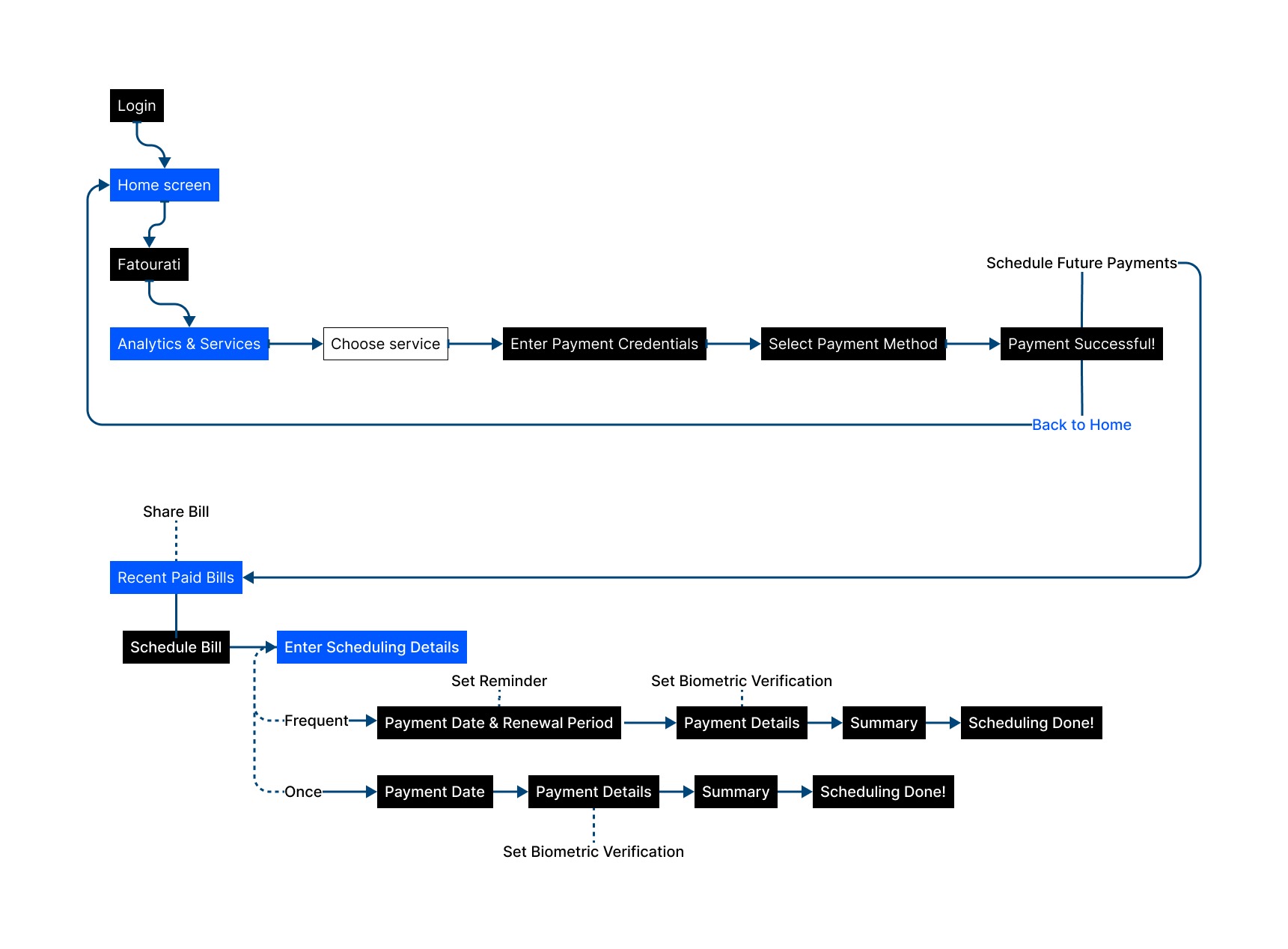
Feature #1 user flow
Bill payment and Auto-Renew feature workflow:
This workflow showcases the user flow of the newly introduced features and breaks down processes the user takes to achieve specific tasks.
The Product UI Reimagined
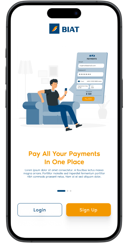
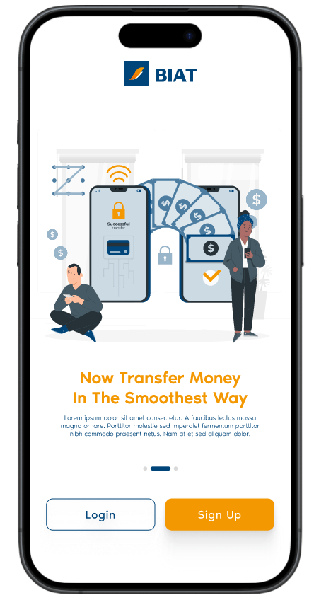
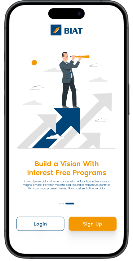
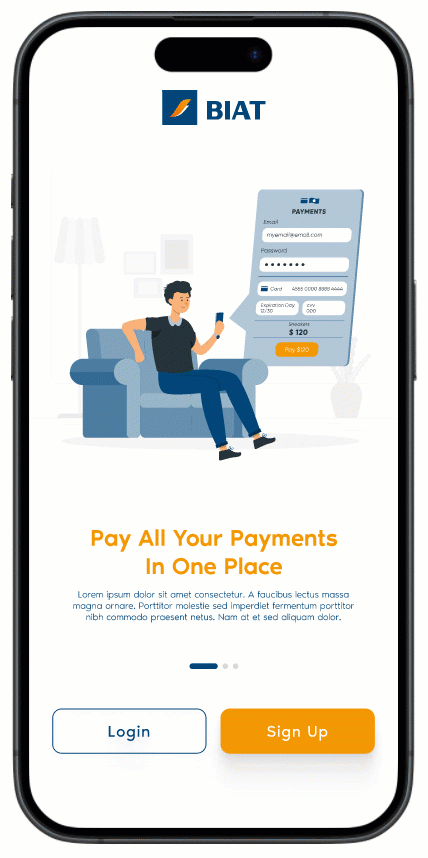
Onboarding screen
The app welcomes its users with an approachable onboarding screen that introduces the newly designed product with freshly designed illustrations that convey the value proposition of the company throughout the rolling screens.
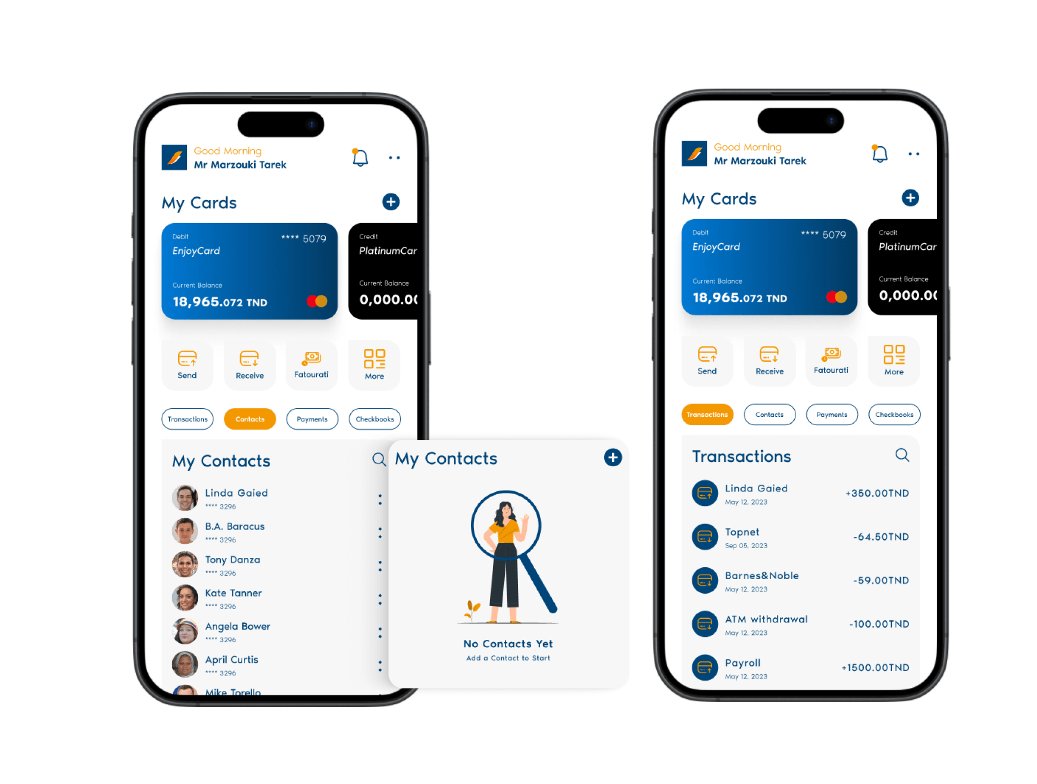
Home screen
The main issue of the current home screen is disarrangement in terms of the flow of the UI so the new home screen starts with a section that contains the logo and a greeting depending on the time of day, a notification icon and more icon that has many of the settings followed by a cards management section.
Then the services section, and finally action chips that are linked to the bottom section depending on where the user clicks.
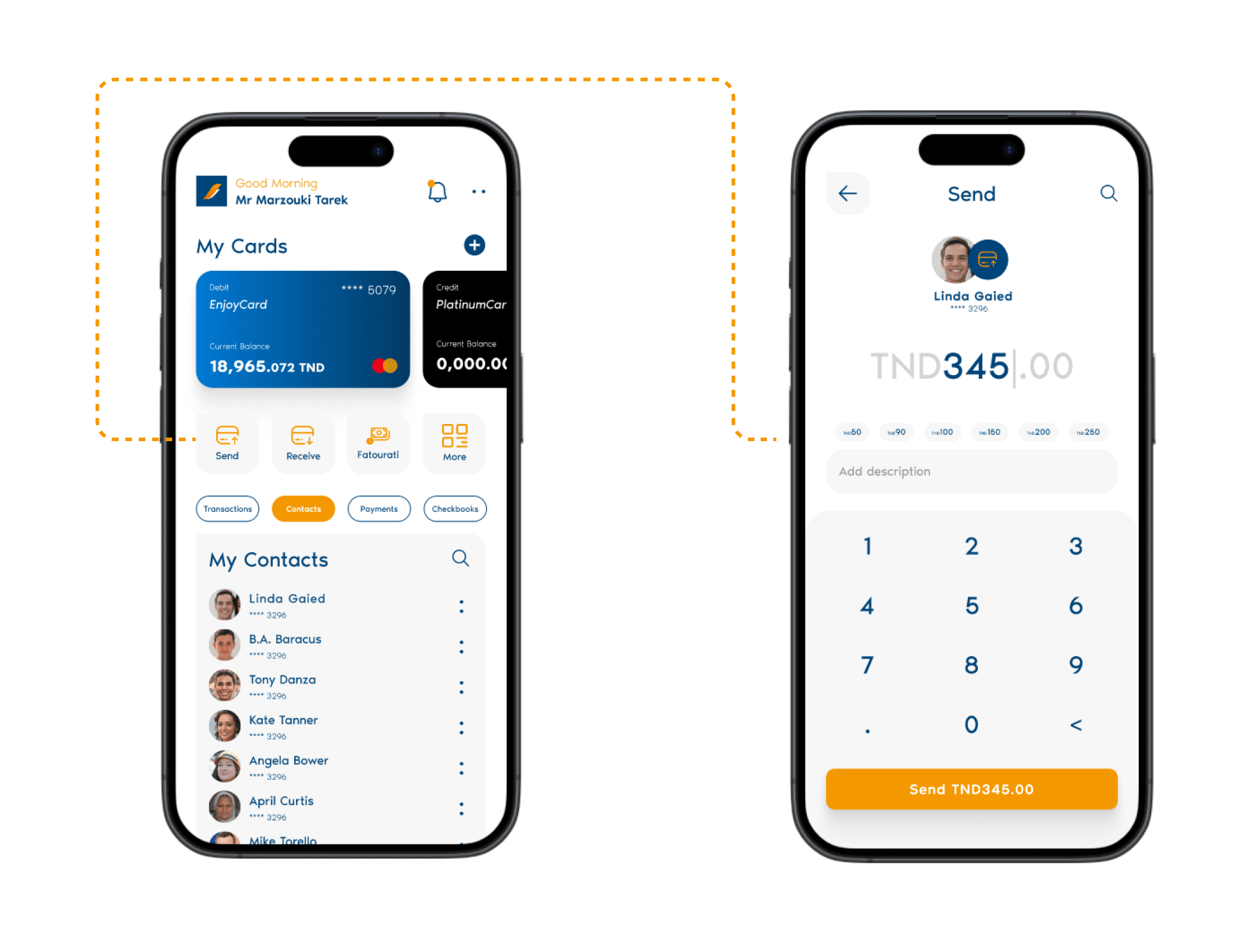
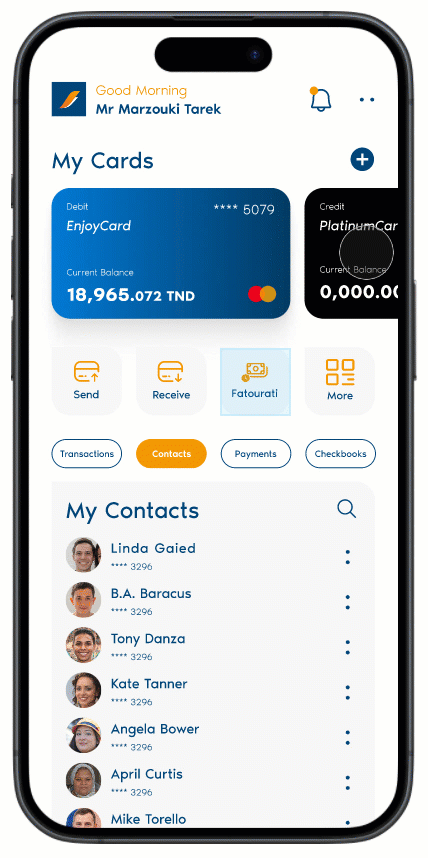
Send Money
The Send service is as simple as it gets, straight with a tap from the home screen and with the option of selecting any beneficiary/contact created so the process would be easy and straightforward.
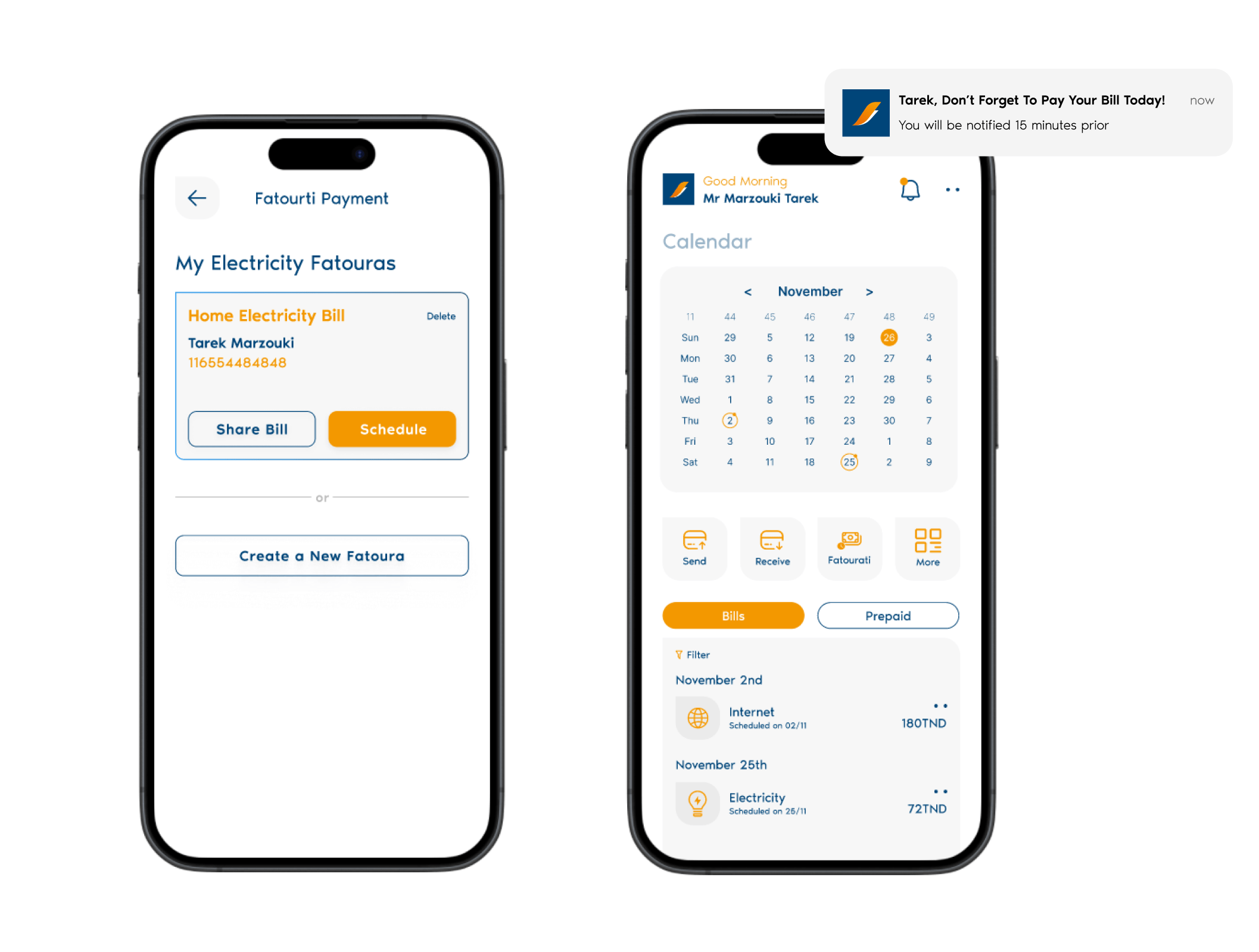
Bill Payment & Analytics
While thinking about introducing new features, the feature most mentioned by the interviewed users was bill payment so after much research and iterations I came up with a screen that contains both the analytics bar which has the current month, what bills are left and what is paid and finally the services bar and the bottom section reserved for the two types of bills. Check the prototype below.
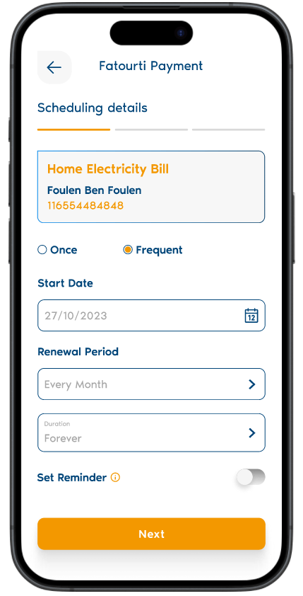
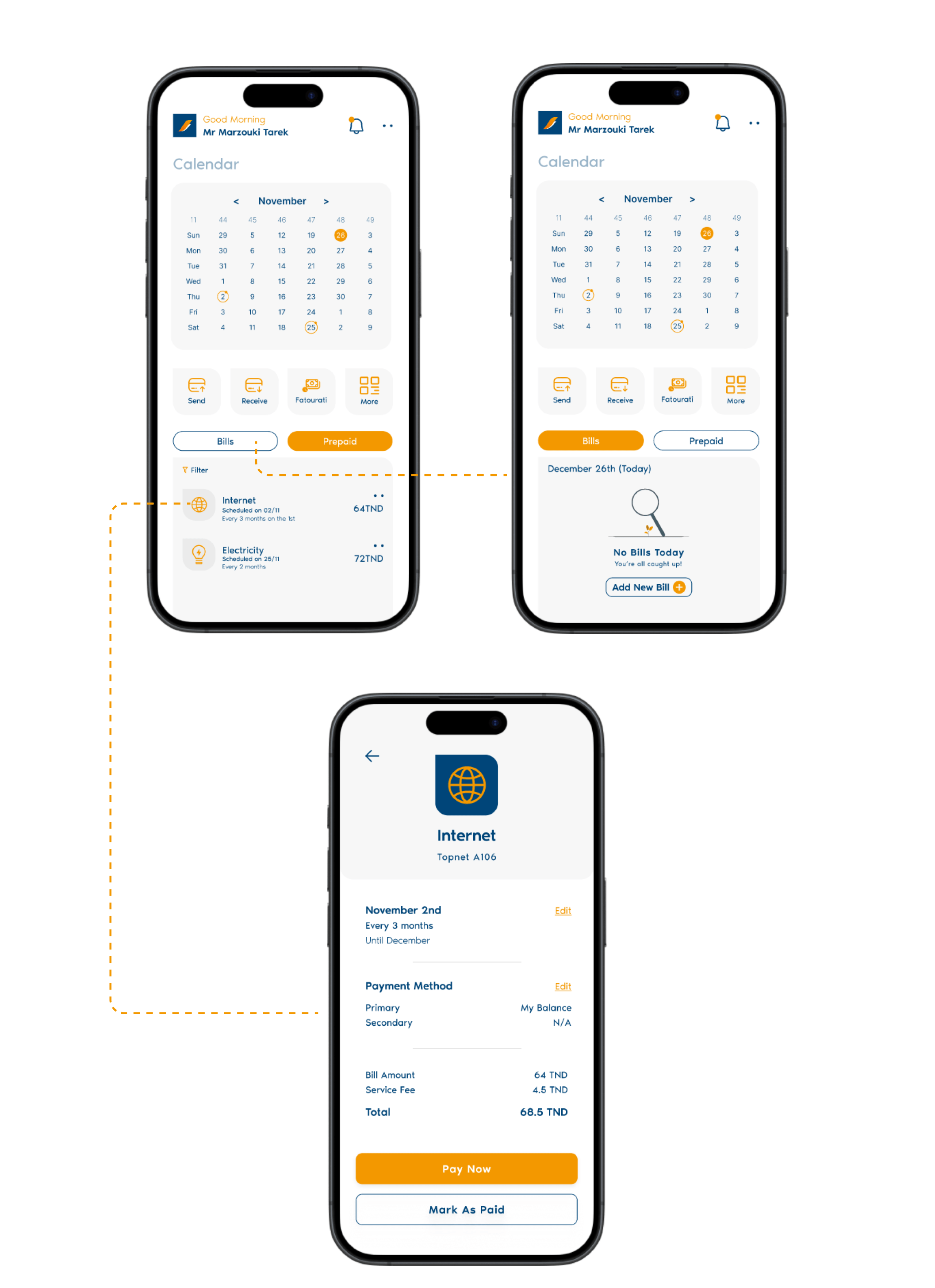
Auto Renew & Schedule Payments
The auto-renew feature works as an extra option for people who want to free themselves from the hassle of paying bills on every due date and it works in both ways whether it is a one-time schedule or even a forever schedule
It contains several security and general options such as reminder setting and biometric confirmation before every scheduled payment. Check the prototype below.
Calendar
The calendar is for people who want to keep organized and tidy their bills in a compartment or a calendar just like in real life, it indicates both paid bills and prepaid bills through filled and stroked ellipses, and it gives the ability to pay your bills even before the due date.
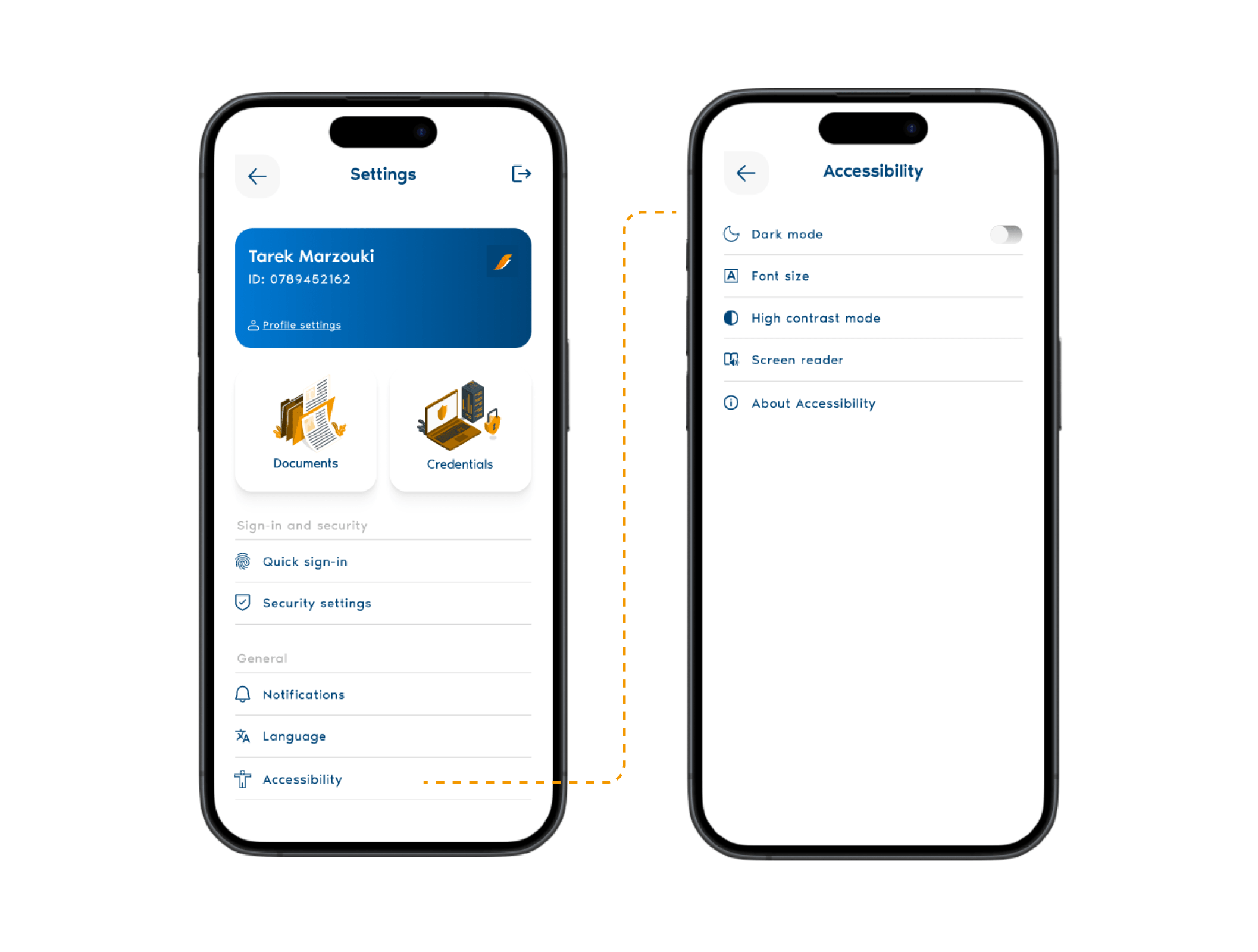
Settings & Accessibility
The settings screen can be accessed from the home screen by tapping on the two dots, it follows the same aesthetic and user flow as the rest of the product.
The accessibility settings were designed specifically for the elderly folks or people with disabilities who are part of the user base, following their needs and concerns; the product gives different options for accessibility to ease the user journey as stated in the screen below.
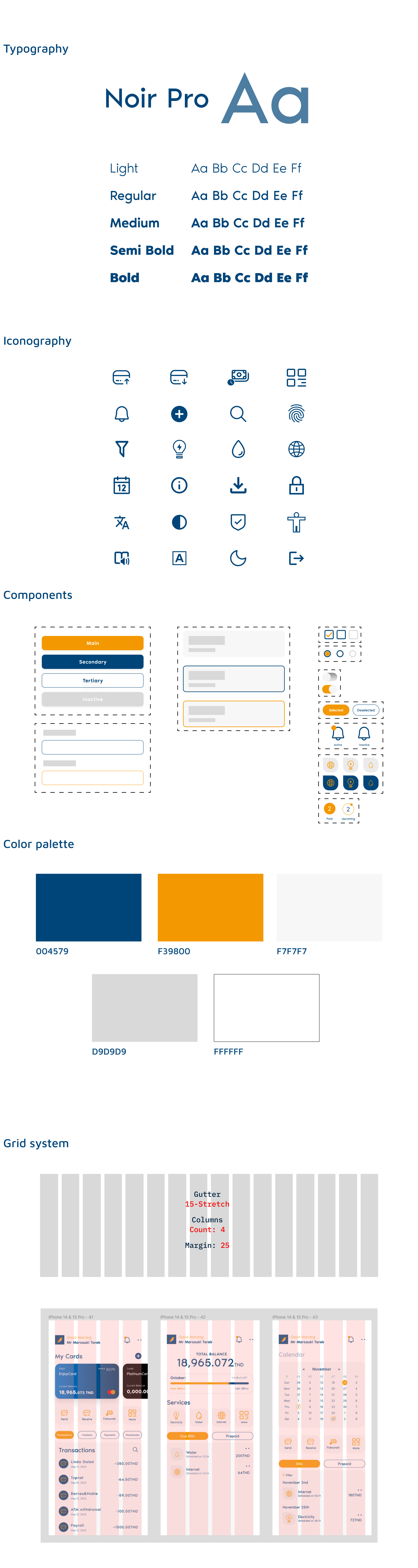
UI Style Guide
Measurable result & impact
The usability test was done over 3 months after the relaunch based on key metrics that encompass user engagement, technical performance, and business impact, which correlated with the stakeholder’s vision in the first place
28%
Increase in users recommending the app to others based on NP score
38%
Decrease in customer support tickets
98%
Authentification Sucess Rate
10/10
Adhrence to Data Encryption and Privacy Compliance
88%
User Journeys Completion of newly implemented features